
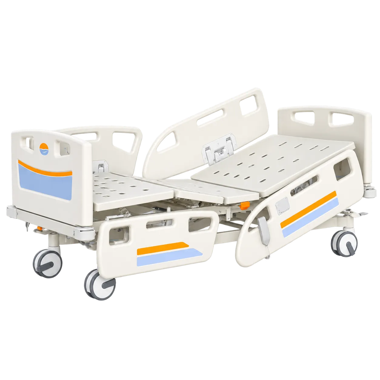

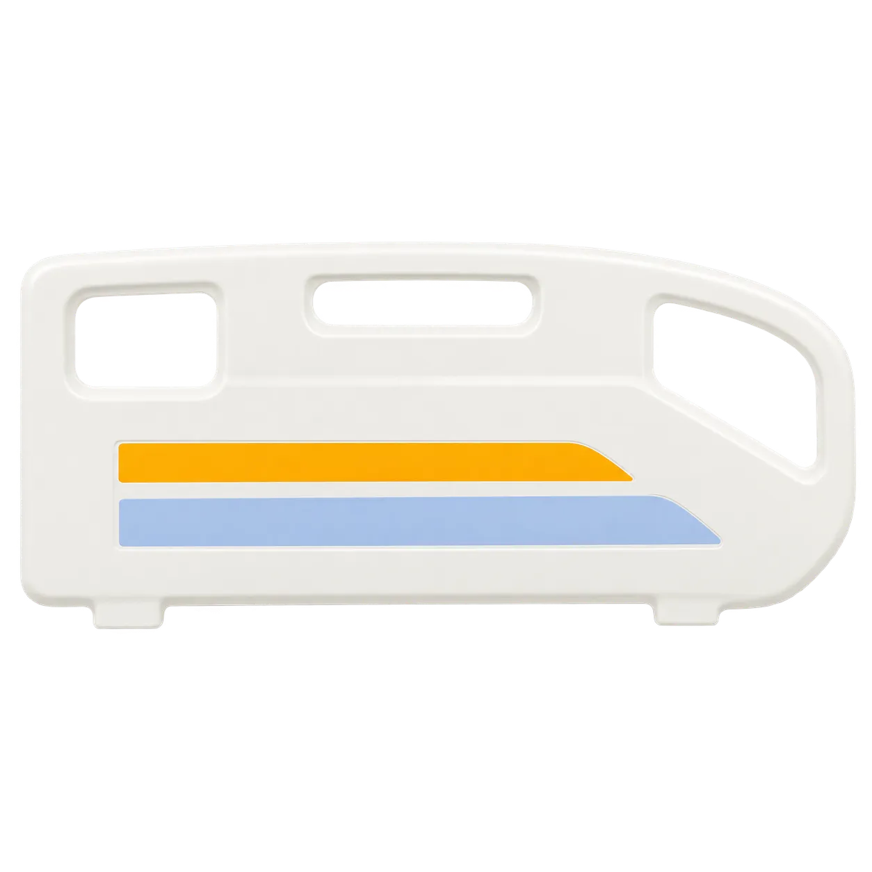


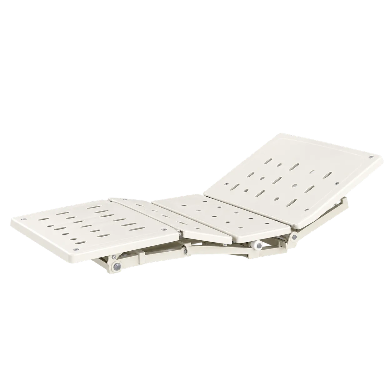
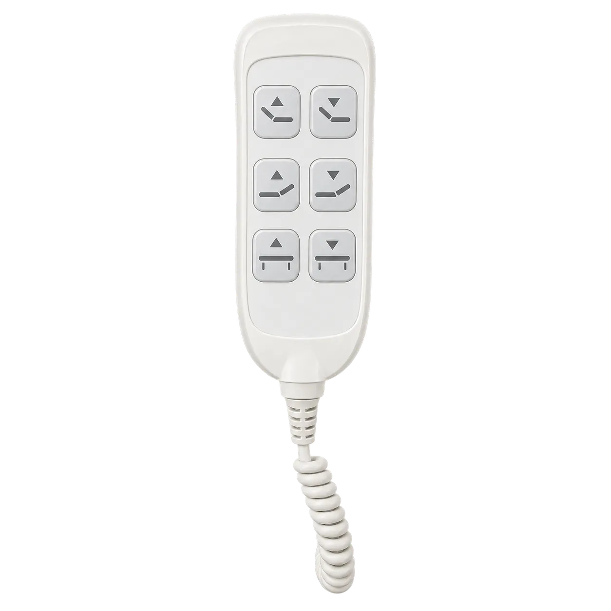
Care homes, dementia units and older people's wards are where the colour on this bed is most likely to matter. Motors raise the back and knees, and move the platform between 430 mm for getting out and 780 mm for care, while the yellow and lilac bands outline the boards and rails that a resident sees and reaches for. Controls in a contrasting colour are easier to find as well.
For people living with dementia or sight loss, recognising objects and edges can become difficult, and white equipment against pale surroundings gives little to go on. Guidance on design for dementia and sight loss recommends contrasting key features with their background, and warns that blues, greens and purples can become harder to distinguish. The yellow bands are the stronger cue here. Staff can point them out to residents as the place to hold. Light matters as much as colour. Their value depends on the room: a bed that contrasts with walls and floor, contrasting bedding, even lighting and a low night light all work together.
Colour is a support, not a safety system. Dementia raises the risk of rail entrapment, so rail use has to be decided person by person, and for many residents a low bed without rails is the safer choice. Coming down to 430 mm helps, though that still falls short of a floor-level bed.
Rooms with pale walls gain most from a coloured bed. The long 2300 mm frame may suit taller residents, once the platform length is confirmed, and the 1000 mm width fits smaller rooms. It is sized for adults of ordinary build, not bariatric patients or children. The conformity documentation those procurement routes require is issued by the manufacturer and provided by the seller.